The Team
--------------------------------------------
--------------------------------------------
1 UI Designer
1 UR Designer
1 Front end Engineer
--------------------------------------------
Project duration: 2 days
Overview
While at Intuit, research and usability became the norm, for everything we did. Designers worked hand in hand with this team, and Quickbooks.com was no exception. We looked to not just do simple A/B tests to move the bar, we ventured into the world of multivariate testing. Multivariate testing is a form of experimentation wherein multiple elements of a webpage are modified and tested to determine which combination of the page leads to the maximum positive impact on conversion.
The Challenge
With this in mind, how could we quickly modify designs in an impactful way, as to increase conversions for our products? In particular, we needed to increase conversion for the Simple Start Free Edition as well as the Pro product by creating some fresh, BOLD ideas, and to test it quickly!
My Approach
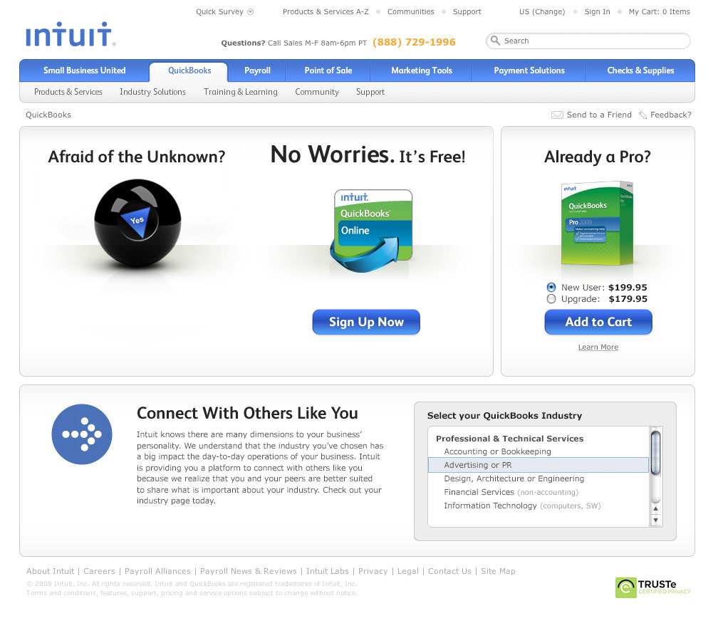
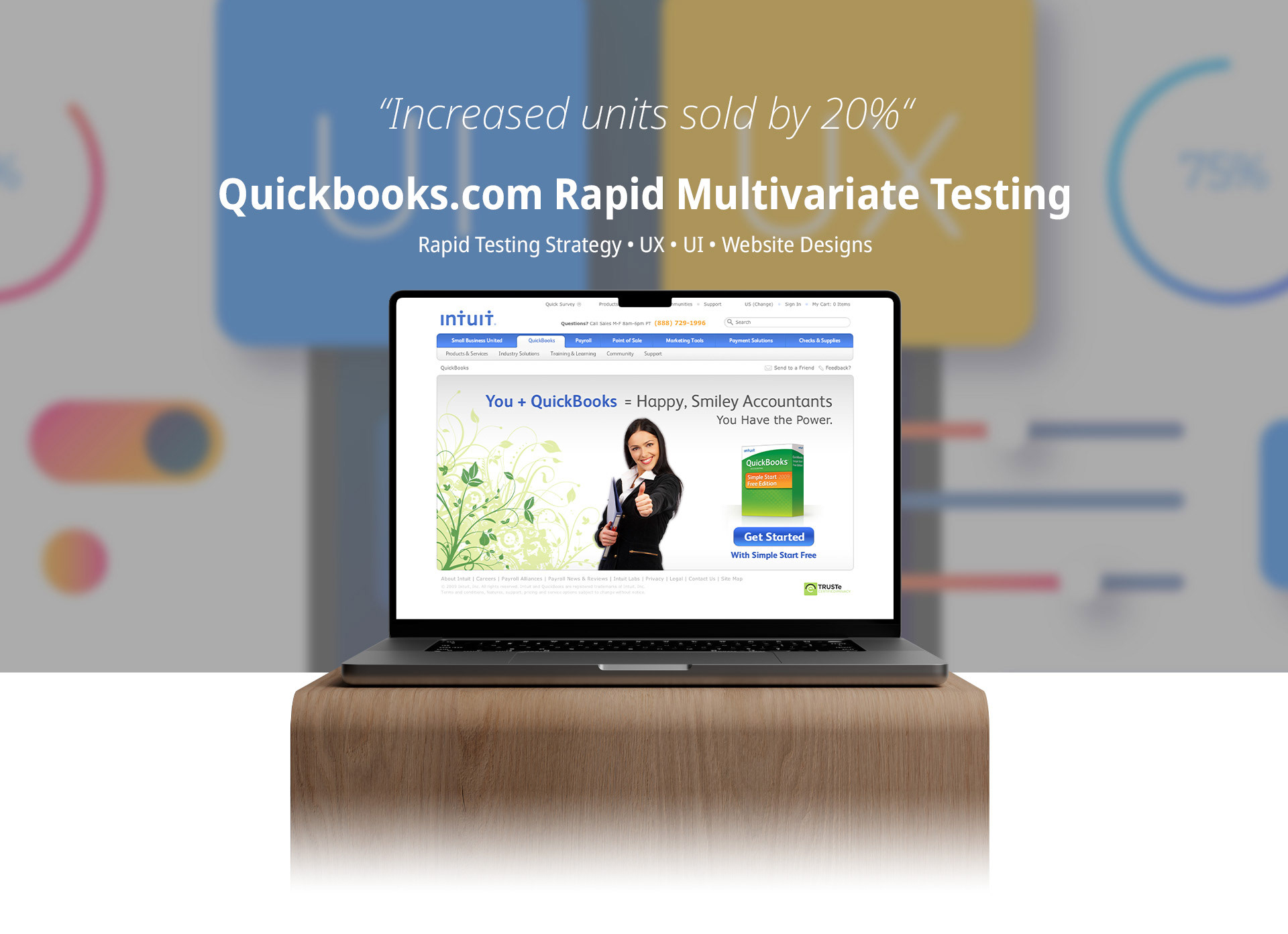
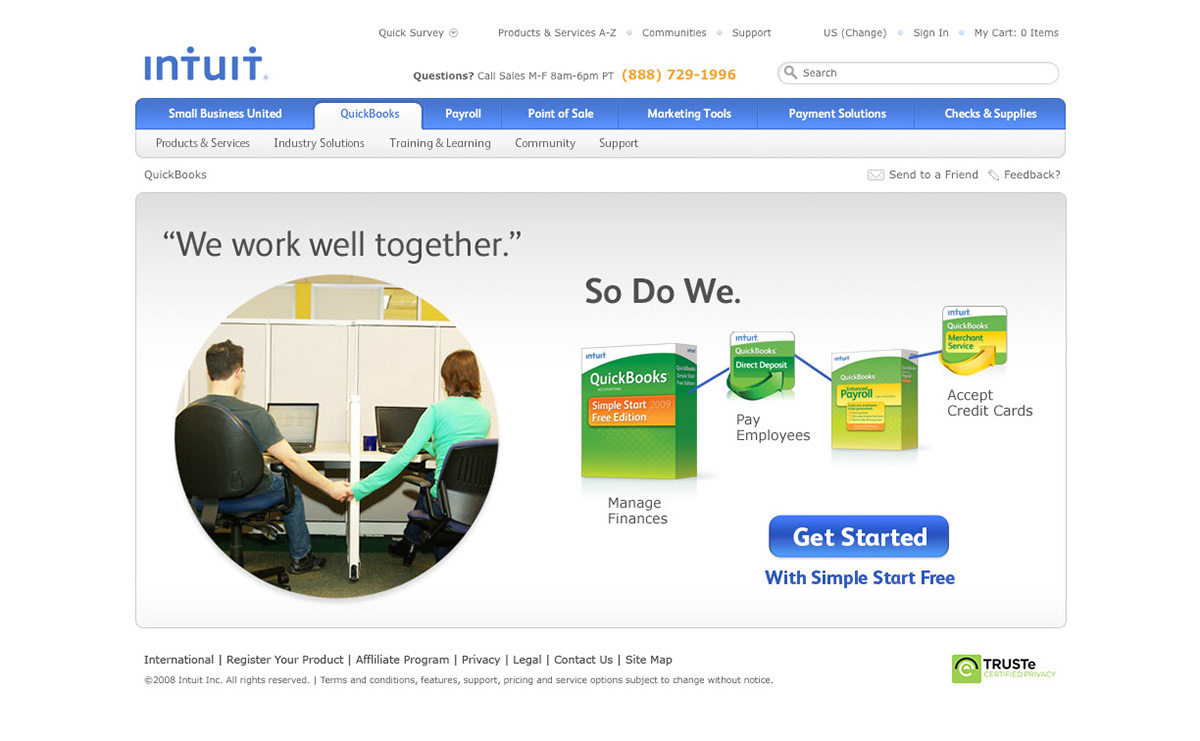
I looked to simplify the homepage by featuring a single core product to funnel visitors faster down the conversion path. I lead the design to this set of tests, from start to finish. Take a look at the original home page:
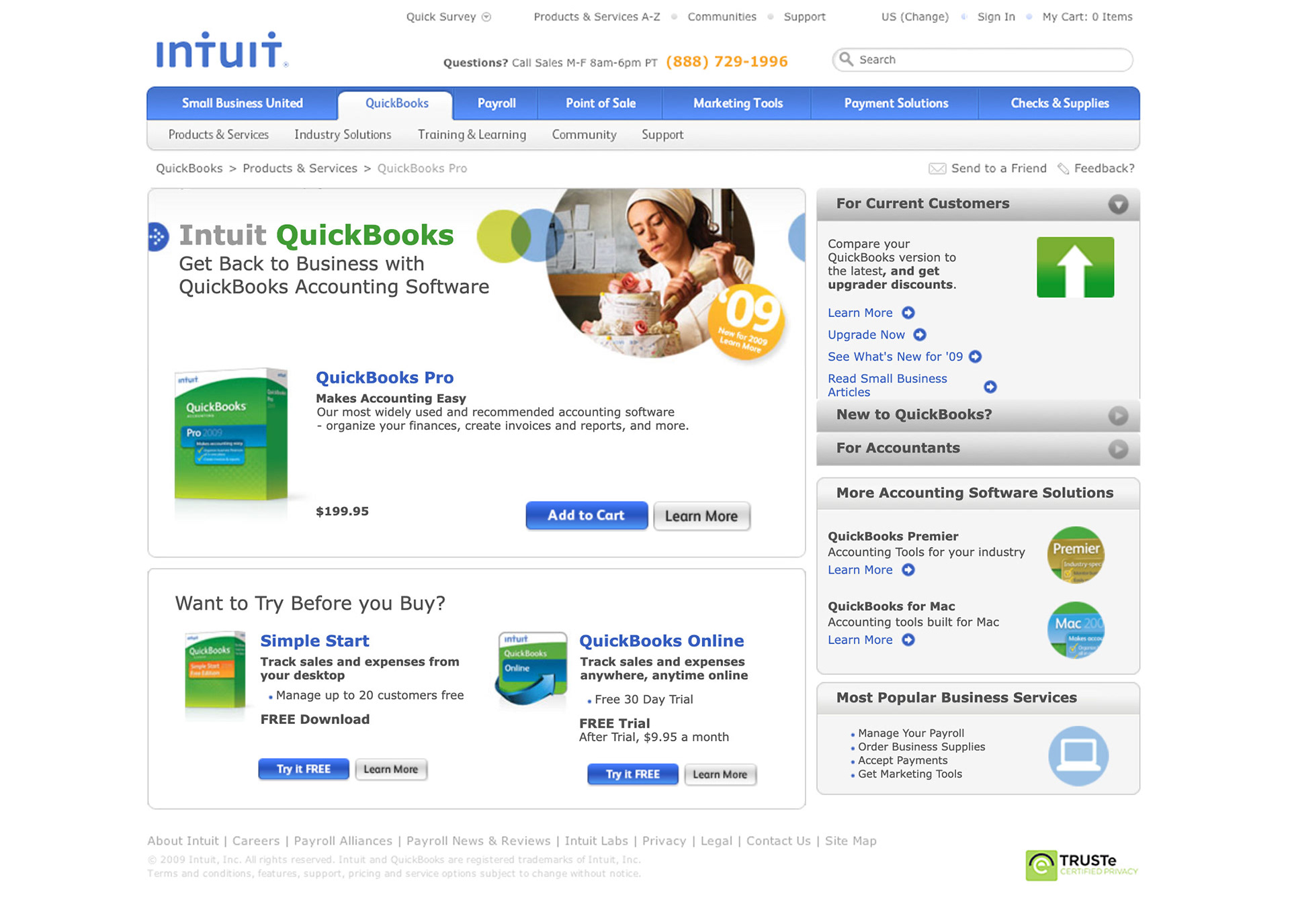
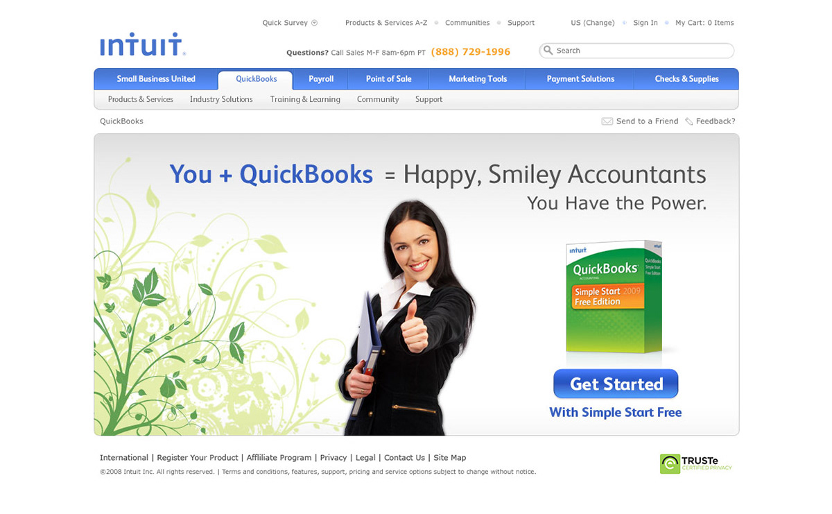
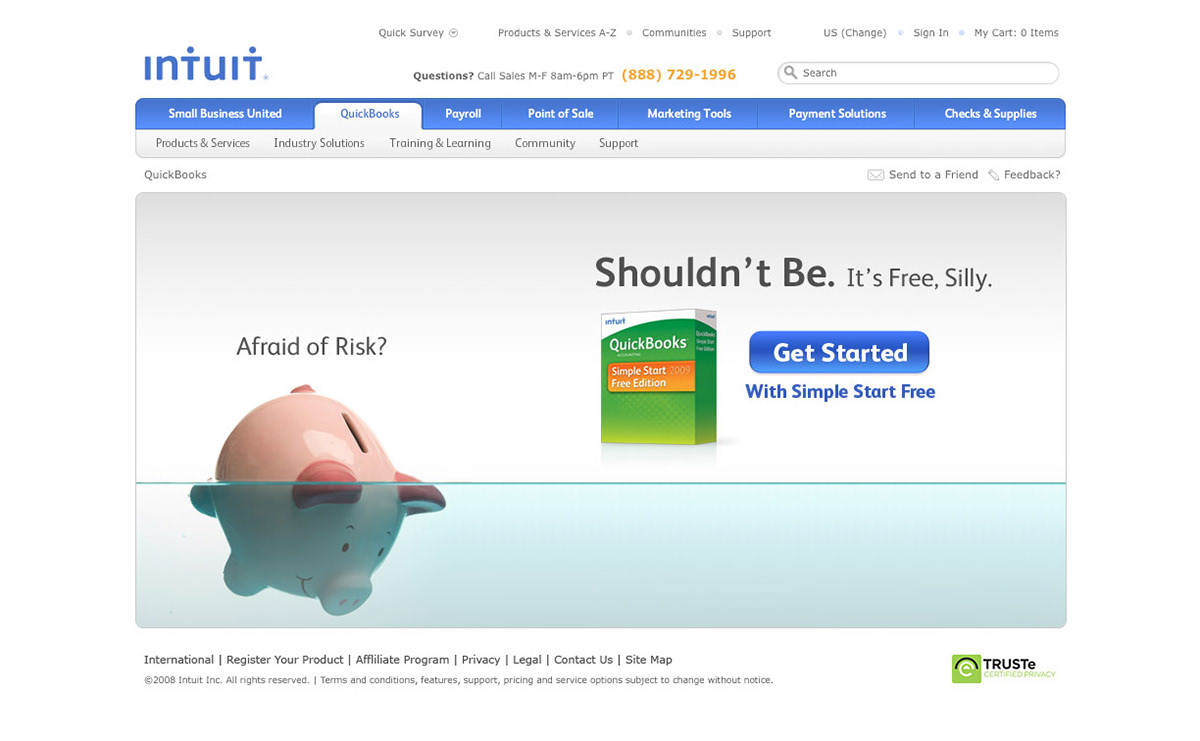
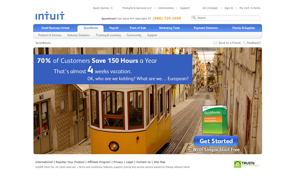
As you can see, there is a lot going on here. The cognitive load is very high. A lot of different tasks are competing for your attention. What if we were to simplify the page and just call out one product we want to concentrate on? What kind of impact would that have on increasing conversion? With these ideas in mind, I set out to create 4 different homepage designs; each with a different focus: Smiling accountants, Risk, Time, and Working well together.
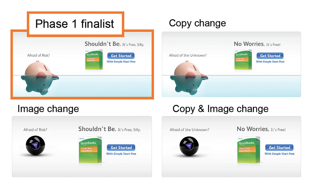
Test 1 Results:
Out of these 4 designs, "Risk" and "Smiley Accountants" showed the greatest evenness of lift. And out of those, "Risk" won. It boosted conversion of Simple Start Free Edition by 60% with no real drop on pro conversion (through the weekend) - Simple Start Free Edition 60% and Pro up 10% during the week.

Next up, Test #2:
The objective for test two was to tease out which aspects of the winning recipes made it successful - whether it was image, text, or the number of calls to action.
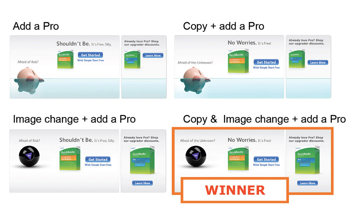
Test #2 results:
The calls to action - 1 for Simple Start Free Addition and 1 for Pro caused the highest lift for units and revenue. The interesting thing was that the copy change as well as the new image worked even better. In the end, the winner succeeded by increasing units by 20%, while not effecting the sale of Pro, thus proving once again, that testing and updating screens leads to even more successful, higher revenue outputs. The power of multivariate tests prove that even subtle changes can lead to much bigger outcomes, while making everyone happy at the same time.